Color is more than just a visual element—it’s a powerful communication tool that can shape perceptions, evoke emotions, and influence customer behavior. In the world of business graphics, from logos and signage to vehicle wraps and marketing materials, the colors you choose can make or break your brand identity.
In this article, we’ll explore color psychology in business graphics and explain why understanding it is crucial for small and medium business owners, marketers, and designers. You’ll learn how colors affect emotions and decision-making, build brand recognition, and even impact conversion rates. By the end, you’ll have actionable strategies to select the perfect hues for your brand and ensure consistency across all visual assets.
What Is Color Psychology in Business Graphics?
Color psychology is the study of how colors influence human behavior and perception. In business graphics, it’s applied to communicate a brand’s personality, values, and messaging through color choices.
For example, red is often associated with urgency, energy, and excitement, making it ideal for promotions or fast-moving brands, while blue evokes trust and stability, perfect for financial or healthcare industries. Understanding these associations allows brands to intentionally shape customer impressions.
Historically, companies have used color in advertising to influence consumer behavior. From Coca-Cola’s signature red to Tiffany & Co.’s iconic blue, color has been central to establishing brand identity. Modern businesses leverage this knowledge in every facet of branding, including digital campaigns, storefronts, vehicle wraps, and printed materials.
Why Color Psychology Matters for Your Brand
Colors Influence Customer Emotions and Decisions
Every color elicits an emotional response. Yellow can convey optimism and friendliness, green signals growth and sustainability, and black often represents sophistication and luxury. Businesses that align their color choices with their brand values tap into these subconscious associations to influence customer behavior.
Brands like McDonald’s, with its bright red and yellow palette, stimulate appetite and urgency, while tech companies such as IBM use blue to convey reliability and intelligence. By intentionally selecting colors, businesses can create marketing materials that resonate with their audience on a psychological level.
Colors Build Brand Recognition and Consistency
Consistent use of color across all branding materials strengthens recall and trust. Research shows that color increases brand recognition by up to 80%, and customers are more likely to choose a brand that appears visually consistent across multiple platforms.
Whether it’s a vehicle wrap, social media graphic, or printed flyer, using a cohesive color scheme reinforces your brand identity. Multi-channel marketing becomes more effective when your audience can instantly recognize your business through color alone.
Color Choice Can Affect Conversion Rates and Engagement
Color impacts not only perception but also measurable business outcomes like clicks, leads, and sales. A well-chosen CTA color, contrasted effectively against a background, can significantly increase click-through rates.
Vehicle wraps, signage, and digital graphics that employ strategic color choices grab attention and communicate your message quickly, converting impressions into leads. Businesses that A/B test color combinations often see measurable improvements in engagement, highlighting the importance of deliberate color strategy.
5 Tips to Choose the Right Hue for Your Brand Graphics
Understand Your Brand Personality and Audience
Start by defining your brand personality—are you fun and energetic, professional and trustworthy, or innovative and tech-savvy? Consider your target audience’s preferences and expectations. Colors should reflect both the brand’s identity and the customer’s emotional triggers.
Know the Emotional Impact of Colors
Different hues evoke different feelings. Red signals urgency, blue builds trust, green suggests growth, and purple communicates creativity or luxury. Map your brand values to the psychological effects of colors to ensure alignment with your message.
Consider Cultural and Industry-Specific Color Meanings
Color perceptions can vary by culture and industry. For example, green may represent prosperity in one market but jealousy in another. Similarly, service-based industries often benefit from blues and greens to signal reliability, while retail brands might favor energetic reds or yellows.
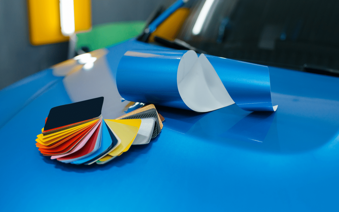
Test Colors Across Different Mediums and Materials
Colors can look different on digital screens, vinyl wraps, printed brochures, and signage. Testing ensures consistency and prevents unintended color shifts that could harm your brand’s professional image.
Consult Professional Designers and Printers for Color Accuracy
Partnering with experts like FTCC Graphics ensures accurate color matching across all applications. From vehicle wraps and signage to digital and print materials, professional guidance guarantees that your brand colors remain consistent, vibrant, and impactful.
How to Apply Color Psychology in Your Business Graphics
Start by integrating color strategy into all visual touchpoints, including logos, marketing materials, and fleet vehicle wraps. Work with professional graphic designers to ensure the colors you choose are both appealing and functional.
FTCC Graphics offers comprehensive services to help businesses apply color psychology effectively. Their team handles design consultations, precise color matching, and professional installation of vehicle wraps and signage to maximize brand impact.
Maintaining color consistency across digital, print, and mobile platforms reinforces brand identity and ensures that your visuals create a cohesive, memorable experience for customers.
Common Mistakes in Color Selection and How to Avoid Them
- Overcomplicating the Palette: Using too many colors can dilute your brand message and confuse your audience. Stick to 2–3 primary colors with complementary accents.
- Ignoring Audience Perception: Not all colors resonate the same way across demographics. Research your target market before finalizing your palette.
- Using Colors That Conflict with Readability: Ensure high contrast for text and graphics on signs, vehicles, and digital media to maintain visibility and legibility.
FAQs About Color Psychology of Color in Business Graphics
Can I use any colors I like for my business branding?
While personal preference matters, strategic color selection based on color psychology in business graphics ensures your colors align with your brand values, target audience, and industry expectations.
How important is color consistency across marketing materials?
Consistency builds recognition and trust. Using the same palette across vehicle wraps, signage, websites, and social media strengthens brand recall and creates a professional image.
What colors work best for service-based vs. product-based businesses?
Service-based businesses often benefit from blues and greens that evoke trust and stability, while product-focused brands may use vibrant, energetic colors to attract attention and drive sales.
How do I ensure my vehicle wrap colors match my digital branding?
Professional design and printing services, like those offered by FTCC Graphics, use precise color matching systems to guarantee your fleet graphics align perfectly with your brand’s digital assets.
Conclusion and Strong Call to Action
Color isn’t just decoration—it’s a strategic tool that influences customer perceptions, drives engagement, and strengthens brand identity. By understanding color psychology in business graphics, businesses can create compelling visual experiences across logos, marketing materials, signage, and vehicle wraps.
FTCC Graphics specializes in helping businesses select the right hues, design cohesive graphics, and execute flawless printing and installation. From consultation to the final wrap, their team ensures your brand looks professional, vibrant, and consistent.
Don’t leave your branding to chance—contact FTCC Graphics today for a free consultation or custom branding quote and start turning heads with the perfect color strategy.
Recent Comments